
Have you ever wondered what your Spotify listening habits really look like? One month you’re blasting upbeat pop anthems during workouts, the next you’re diving deep into moody indie tracks on rainy evenings. Your music taste is unique, ever-changing, and full of surprises.
That’s exactly what the Spotify Pie Chart reveals in the most colorful, shareable way possible. This simple yet addictive tool turns your recent listening data into a vibrant pie chart, showing the exact mix of genres that make up your soundtrack. It’s like Spotify Wrapped, but you can bake a fresh one every month—no waiting until December!
Whether you’re a casual listener or a music obsessive, the Spotify Pie Chart offers a fun, insightful look at your audio world. In this guide, we’ll walk you through everything: what it is, why it’s so popular, how to create your own, what to do with the results, and tips to make the most of your musical discoveries.
What Is the Spotify Pie Chart?
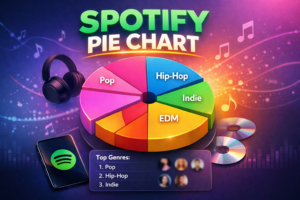
The Spotify Pie Chart is a free online tool that analyzes your Spotify listening history and displays it as a colorful pie chart. Each slice represents a different music genre or subgenre, with the size of the slice showing how much you’ve listened to that style in the past month.
Created by Darren Huang, a student at UCLA, the tool quickly became a hit because it’s simple, visual, and updated monthly. Unlike Spotify’s official year-end Wrapped feature, which drops once a year with flashy animations and global stats, the Pie Chart gives you a fresh snapshot anytime you want.
The chart doesn’t just stop at genres. Below the pie, you’ll usually see a list of your top artists within those genres, plus sometimes top tracks. Hover over a slice (on desktop) or tap it, and more details pop up. It’s a quick, delightful way to see your current vibe—who knew you were 35% hip-hop this month?
Many people love sharing their pies on Instagram Stories, Twitter (X), or TikTok with captions like “My music taste in one chart 😂” or “Send this to someone who gets me.” It sparks conversations and friendly roasts among friends.
Why the Spotify Pie Chart Feels So Addictive
Music is deeply personal. Seeing your habits turned into a bright, easy-to-understand visual hits different. Here’s why this tool resonates with so many listeners:
- Monthly Freshness: Your taste evolves. One month you’re all about discovering new K-pop groups; the next, you’re revisiting classic rock. The Pie Chart captures that shift in real time.
- Surprise Factor: You might think you’re a pure pop fan, but the chart reveals a sneaky 15% electronic or folk influence. It’s like a mirror for your ears.
- Shareability: The colorful design looks great on social media. People love comparing pies—“Your chart has way more indie than mine!”
- No Extra Apps Needed: It works right in your browser. No downloads, no sign-ups beyond logging into Spotify.
In a world full of data dashboards and complicated analytics, the Pie Chart keeps things light and fun. It’s not judging your taste—it’s celebrating it.
How to Create Your Own Spotify Pie Chart (Step-by-Step Guide)
Making your Spotify Pie Chart takes less than a minute. Here’s exactly how:
- Open your web browser (on phone or computer) and go to the official Spotify Pie site: https://huangdarren1106.github.io/
- Click the big “Login with Spotify” button.
- You’ll be redirected to Spotify’s login page. Enter your credentials if you’re not already signed in.
- Spotify will ask for permission. The tool only requests read access to your listening data—it won’t change playlists, follow artists, or do anything else. Review the permissions, then click “Agree.”
- Wait a few seconds while it processes your recent activity. Your personalized pie chart will appear!
On mobile, the chart might look a bit different but still works great. For the best view with all details, try it on a desktop browser first.
Pro Tip: Clear your browser cache or try incognito mode if you run into login issues. Also, make sure you’ve been actively using Spotify in the past month—the more data, the more accurate (and interesting) your pie.
Once generated, you can screenshot it, download it if the site offers that option, or simply share the results directly.
What Your Spotify Pie Chart Actually Shows
The main visual is the pie itself. Larger slices mean you listened to that genre more. Smaller slices show occasional listens. Colors make it pop—bright pinks for pop, deep blues for hip-hop, earthy tones for folk or indie.
Below the chart, you’ll typically find:
- A legend explaining which color matches which genre
- Your top genres ranked by listening percentage
- Top artists in those genres, often with play counts or rankings
- Sometimes top tracks or additional insights
Genres can be broad (like “Pop” or “Hip-Hop”) or more specific (like “Indie Pop,” “Trap,” or “Lo-fi”). The tool pulls from Spotify’s own genre tags, so results feel consistent with how the platform categorizes music.
Your chart only reflects the last month’s activity, so it’s a current snapshot rather than your all-time favorites. That’s what makes it dynamic and fun to revisit.
Spotify Pie Chart vs. Spotify Wrapped: Key Differences
Many people compare the Pie Chart to Spotify Wrapped. Here’s a quick breakdown to see how they differ:
- Time Period: Pie Chart = last month (refresh anytime). Wrapped = entire year (once a year).
- Format: Pie Chart = simple, colorful pie with genres. Wrapped = full slideshow with songs, artists, minutes listened, global rankings, and memes.
- Frequency: You can generate a new Pie Chart every few weeks. Wrapped is a big annual event.
- Focus: Pie emphasizes genre mix. Wrapped highlights top songs, artists, and fun facts like “You discovered 47 new artists.”
- Availability: Pie works year-round. Wrapped is seasonal.
Both are enjoyable in their own way. Use the Pie Chart for regular check-ins and Wrapped for that big end-of-year celebration. Together, they give a fuller picture of your evolving taste.
Some fans also combine them with other tools like Receiptify (which turns your stats into a shopping receipt) or Icebergify (which creates a “music iceberg” of mainstream vs. obscure tastes) for even more fun.
Real-Life Examples: What Different Pies Look Like
Imagine these common scenarios:
- The Pop Lover: A huge pink slice for pop (60%), medium pop-rock and dance, tiny slices for everything else. Top artists might include Taylor Swift, Olivia Rodrigo, or The Weeknd.
- The Eclectic Listener: Many medium-sized slices across indie, alternative, hip-hop, R&B, and electronic. This person probably has diverse playlists and loves discovering new sounds.
- The Hip-Hop Head: Dominant rap/trap slice, with smaller contributions from R&B or pop crossovers. Artists like Drake, Kendrick Lamar, or emerging local rappers might top the list.
- The Chill Vibes Person: Big lo-fi, ambient, and indie folk slices. Perfect for someone who uses Spotify for study or sleep playlists.
Your own pie might surprise you. Maybe you listened to more Bollywood or regional tracks than you realized, especially if you’re in a place like Pakistan where fusion music blends beautifully with global sounds.
One user shared that their pie revealed they were listening to twice as much classical this month because of a new podcast habit—something they never would have noticed otherwise.
Tips to Make the Most of Your Spotify Pie Chart
Here are practical ways to turn your chart into real music growth and enjoyment:
- Track Changes Over Time: Generate a new pie every 4–6 weeks. Compare them side by side to see how your mood, season, or new discoveries shift your listening.
- Discover New Music: Look at smaller slices. If “Jazz” is only 5%, explore a jazz playlist to grow that part of your taste.
- Refine Your Playlists: Use the top artists and genres to create or update playlists. Group similar vibes together for better listening flow.
- Share and Connect: Post your pie on social media and ask friends to share theirs. It’s a great icebreaker or way to exchange recommendations.
- Spot Patterns: Notice if certain genres spike during workouts, commutes, or late nights. Use that insight to build better daily playlists.
- Clean Up Your Library: If you see genres you no longer enjoy, unfollow related artists or remove old playlists to help Spotify’s algorithm serve you better.
For Premium users, combine your pie insights with Spotify’s own features like Blend playlists (with friends) or Daylist (daily personalized mixes).
Common Questions About the Spotify Pie Chart
Is it safe to log in? Yes. The tool uses Spotify’s official API and only asks for read permissions. It doesn’t store your password or make changes to your account. Still, only use trusted sites and revoke access later if you want (you can do this in Spotify settings under “Apps”).
Can I use it on mobile? Absolutely. It works in any modern browser, though desktop often shows more details at once.
What if my pie looks weird or has unexpected genres? Spotify’s genre tagging isn’t perfect. Some artists get broad or overlapping labels. The chart reflects what you actually played, so trust the data even if it surprises you.
Does it work for free accounts? Yes! Both free and Premium Spotify users can create their pie.
Can I save or download the chart? Most users take screenshots. Some versions of the tool offer direct download or share buttons.
Beyond the Pie: Other Fun Spotify Stats Tools
If you love the Pie Chart, try these similar tools for more insights:
- Stats for Spotify: Detailed top songs, artists, and genres over different time periods.
- Receiptify: Turns your top tracks into a cute receipt image.
- Obscurify: Rates how “basic” or unique your taste is.
- Icebergify: Creates layers showing mainstream vs. deep-cut artists.
- Last.fm: Tracks scrobbles across platforms for long-term history.
These tools together can give you a complete picture of your music life.
Why Understanding Your Music Taste Matters
Music shapes our moods, memories, and even productivity. Knowing your current mix helps you:
- Curate better playlists for different activities
- Discover artists you’ll love but haven’t found yet
- Share your vibe more easily with friends
- Appreciate how your taste grows and changes over time
In places like Hyderabad, Sindh, where people enjoy everything from Sufi classics and local folk to global pop and hip-hop, the Pie Chart can beautifully reflect that rich cultural blend.
Don’t be afraid if your chart looks “all over the place.” Diverse listening is a strength—it keeps things fresh and opens doors to new emotions and ideas.
Ready to Bake Your Own Spotify Pie?
Your music story is waiting to be visualized. Head over to the Spotify Pie website, log in, and see what your monthly mix looks like today. You might laugh, feel validated, or get inspired to hit play on something new.
Once you have your chart, share it with friends or save it as a reminder of this moment in your listening journey. Then come back next month and watch how it evolves.
What does your pie say about you? Drop your results in the comments—I’d love to see the wild mixes people are rocking right now!
Now go hit that login button and enjoy the delicious insights. Your ears (and your feed) will thank you.
FAQs:
Q1: What is the Spotify Pie Chart?
A: It’s a free tool that turns your recent Spotify listening data into a colorful pie chart showing the percentage of different music genres you’ve been playing.
Q2: How do I make a Spotify Pie Chart?
A: Visit https://huangdarren1106.github.io/1, click “Login with Spotify,” agree to permissions, and your personalized chart appears in seconds.
Q3: Is the Spotify Pie Chart different from Spotify Wrapped?
A: Yes. The Pie Chart updates monthly and focuses on genre mix, while Wrapped is an annual recap with songs, stats, and more.
Q4: Is Spotify Pie Chart safe to use?
A: Yes, it uses official Spotify login and read-only access. Your password stays secure with Spotify.
Q5: Can I use Spotify Pie Chart on my phone?
A: Absolutely—it works in any browser on mobile or desktop.
You may also read newsprimeo.